Delivery driver navigation app
Introducing a new app and native pattern library that delivers:
• Enhanced design quality through standardised patterns
• Accelerated development with reusable components
• Consistent user experiences across platforms
• Reduced driver cognitive load for safer operations
• Increased workflow satisfaction with intuitive design

Problem
The current delivery driver navigation app suffers from an outdated UX/UI, lacks design system consistency, and is burdened by significant design debt, making even minor UX updates complex and time-consuming. Disorganised file management and the absence of a single source of truth hinder collaboration and efficiency. Additionally, the app's legacy technology stack requires extra development effort for front-end updates, and the app's usability issues contribute to cognitive overload for delivery drivers. Furthermore, the app is not integrated within the broader Woolworths ecosystem.
Solution
Redesign and rebuild the delivery driver navigation app with a modern and intuitive UX/UI, fully aligned with the Woolworths design system to ensure consistency. This initiative will address the existing design debt, streamline the update process, establish a well-organised file management system and a single source of truth for design assets. Leveraging a modern technology stack will simplify front-end development. The improved usability will reduce cognitive load for drivers, enhancing their efficiency and overall experience. Finally, integrating the app within the Woolworths ecosystem will create a more cohesive and connected experience.
Current experience

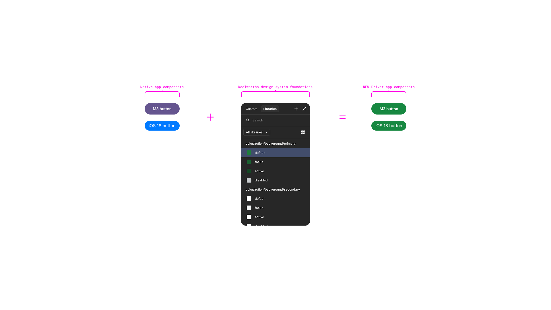
Branded native pattern library
How I took the native Android and iOS component libraries, restyled with the Woolworths foundations to fit into our eco-system and forge the product’s own pattern library to improve design and development speed and consistency, as well as reducing driver cognitive load and improving trust for the product.
Image carousel:
1. Native buttons, styled with Woolworths foundations to create hybrid component.
2. Native components, styled with Woolworths foundation and icons to create pattern.
3. Pattern component set for both Android and iOS, examples shown navigation, segmented control and delivery card.


Conceptual experience
Image carousel:
1. Preview route - Today's route - Delivery summary
2. Suggest break - Break moved - Break active
3. Drop feedback - Today's route feedback


Validating our designs with drivers
Test usability of the proposed flow and new patterns to get initial driver feedback.

Today's route
Drivers reported having the information they needed on thispage: “I think that in this page is missing nothing’
Both drivers reported that they mainly use the window timeand the planned time is not referred to. One driver reported theplanned time would confuse new drivers but the other driverreported liking seeing both sets of times: “I like this I can seeboth information that's really helpful.” One driver proposed thistime could just highlight how long a drop should take, eg 15minutes. Both drivers understood the copy used.
One driver seemed to confuse the ‘skip’ button with skipping navigation.

Delivery summary
Drivers liked the information that was included in deliverysummary. One driver specifically liked the tote informationbecause they can forget frozen items: “in this part we reallyneed everything”
Drivers liked the delivery notes section
Drivers struggled to guess what information would be indelivery summary, one expected tote information but bothwere happy to see what was included once shown.
Drivers reported they would utilise this information beforenavigating: “if I can see before navigate because sometimethe customer put some chips about the address and trains orsomething like that and it's nice checking this one beforegoing to the next drop”

Order feedback
Both drivers liked the ability to add feedback for a drop:“Yeah, that's nice. You can put comments. Yeah, I don't havethis today, but it's nice.” “So it's really important to put somecomments for you guys be aware about what happened inthis address or in the city suburbs”

Order breaks
Drivers liked the ability to postpone the break
Drivers correctly identified that taking the break now wouldstart a 30min timer
Drivers liked having upfront visibility of the break: “I like thisbecause all the times you suggest my break, becausesometimes I can forget as well.’
Credits
UX/UT: Danni Clores
UX/UI: Oli Bray
Recent design projects
Explore my latest work and design solutions.
